Redesign Concept
NParks Explore a Route (NEAR)
Launched by NParks, NEAR is a mobile app designed to complement Singapore's nature trails for an interactive, curated walking experience island-wide.
Despite undergoing several revamps with the latest one from 22 May 2022, NEAR still has weaknesses in its user experience.
Poor navigation systems, insufficient coverage of information on routes, as well as cluttered and outdated UI have driven users to quit the app and rely on alternative platforms instead.
(1.2 from 275 reviews on Google Play)
To examine the usability and improve users' satisfaction by giving NEAR a revamp focused on its core functions.
To propose a web version that complements the app's functions, enhancing the overall user experience.
DURATION
4 weeks, June 2022
ROLE
User research
UI/ UX Design
TYPE
A self-initiated project as part of the Google UX Design Professional Certificate
DELIVERABLES
Mobile App & Website Visual Prototype
TOOLS
Figma
Photoshop
The Problem
Goal
01 Existing Design
Despite undergoing several revamps, NEAR still suffers a poor rating of 1.2 stars.
Launched by NParks, NEAR is a mobile app designed to complement Singapore's nature trails for an interactive, curated walking experience island-wide. Despite undergoing several revamps with the latest one from 22 May 2022, NEAR still has weaknesses in its user experience.

1.2
276 reviews
.png)
1
2
3
4
5
.png)
Existing Screen Designs
Poor UX driving users to quit the app and rely on alternative platforms.

User Reviews from Google Play
Challenge
How might we enhance the core functions of NEAR to support users in exploring Singapore's nature trails with ease and enjoyment?
02 Understanding the User
User Research
Breaking it down to rebuild it
click on each heading to view the process!
Research Insights
User
Pain Points
3 primary user pain points were identified based on user research.
01
Ineffective navigation system and representation
The app does not provide directional prompts and options to set start and end points. The navigation map is of the standard style which is too cluttered and lacks essential information for hiking.
02
Insufficient coverage of information on routes
The 'Explore' tab lacks information on trail distance, difficulty level, nearby amenities and reviews etc., which is key to every user's research and preparation process.
03
Visual overload from superfluous UI components
The UI components are used superfluously, cluttering the interface with buttons, images, and texts. Such visual overload overwhelms users from the task at hand.
User Personas
Nature Super Mom,
Monica
2 personas representing the ideal users of NEAR were crafted to give an in-depth understanding of the user goals and frustrations so that solutions can be explored to answer specific user needs.
.png)
User Persona 1
Monica is constantly on the lookout for beginner-friendly nature trails to spend quality outdoor time with her young toddler. As a meticulous individual, she plans her trips beforehand so that her family can have a safe and enjoyable time with nature.
However, NEAR has failed to provide her with the information she requires in planning. She often has to spend unnecessary effort toggling between multiple platforms to piece together information of the trails (weather, amenities, route options, difficulty level).
Digital Savvy Adventurer,
Joey
.png)
User Persona 2
Joey is constantly on the lookout for new and scenic trails to explore with his friends. As a digital savvy individual, he likes to rely on his mobile device to navigate and explore the trails, as well as to capture photos and records of his many trails.
However, NEAR has failed to provide him with any help in navigation. Without the function to set start and end points for his trip, he is unable to obtain any directional prompts to navigate forward, as well as information on nearby amenities and spots to look out for during the trip.
Through the journey,
A user journey is then mapped to visualize their emotional experience across all touchpoints of NEAR to help resonate with the users better and identify areas for improvement to better answer their needs.
.png)
User Journey
Goal Statement
Enhance NEAR as a platform where users can efficiently source for information on Singapore's nature trails, and be equipped with enough knowledge to decide and prepare for their hike.
During the hike, NEAR aims to provide a clean and easy-to-use navigation system where users can navigate the trail confidently and effortlessly.
03 Starting the Design
Main Themes
.png)
Design Ideas
Priority 1
Start, end and checkpoints
Add start, end and checkpoints to help users see where they are and where they are heading. Option to reroute/ uncheck points during the journey.
Priority 2
Information Hub
A hub with bite-sized information & visuals on the route's background, highlights, explorers' gallery, reviews, location and nearby amenities.
Priority 3
Map customisation
Function to customise layers of information showing on the map which includes: amenities/ photo spots/ wildlife etc.
Priority 4
Filter & Sort
Search filter with interactive sliders and keyword filters, for users to toggle between their preferred distances, difficulty levels and environments.
Priority 5
Browsing Gallery
Trail options displayed in a masonry layout with a representative thumbnail image tagged with review ratings.
Priority 6
Multi-device Experience
A complementary web version to serve as a more comprehensive pre-trip preparation guide, enhancing the overall user experience across all touchpoints.

User Flow
Information Architecture
.png)
Testing the Concepts
.png)
.png)
.png)
.png)
Assembled
Map
Directional Tracker
General Topography for Map Navigation
Buttons
Trail Progress
.png)
.png)
NEAR Redesigned
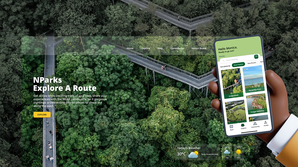
The NEAR desktop web and mobile app are designed to provide a complementary multi-device experience across all touchpoints.
The Complementary Experience

Desktop web version:
Pre-trip preparation
.png)
Phone app version:
Real-time navigation
NEAR Mobile App


Onboarding
The app starts with an onboarding process to guide first-time users through its key features.
Explore > Map > Share
01
Explore
The search filter includes interactive sliders and keyword filters, allowing users to toggle between their preferred distances, difficulty levels and environments. Search results are tagged with ratings, allowing users to efficiently decide on a suitable route.
Explore > Search Filter > Search Results
02


Route Information
Each individual route information is bite-sized and comes with eye-catching graphics, giving users a brief on the route's background, highlights, explorers' gallery, reviews, location and nearby amenities.
Place of Interest > Information > Location
Start
Upon deciding on a route, users will be prompted to the 'Start' tab to embark on the journey.
Build Route > Add Start & End Points > Start
03


Navigating Checkpoints
Checkpoints to help users see where they are, where they are heading, and the progress of their hike.
Trail > Checkpoint > Checkpoint Progress
Map Layers
Allowing the option to add satellite imagery and layer on other relevant information (amenities/ photo spots/ cycling paths/ traffic etc.) to aid with users' navigation.
Map Layers > Map Type > Map Details


Post-Trip Documentation
When the trail is completed, users can keep a record of their trail experience, and also share it to the rest of the community.
End Trip > Share
04
At a Glance
.png)
Onboarding 1
Onboarding 2
Onboarding 3
Landing Page
Explore
Search & Filter
Search Results
Trail Background
Trail Information
Trail Location
Start Trail
Trail Progress
Trail Checkpoint
Trail Checkpoints
Explore
Map
Share
Onboarding
Trail Layers
Updated Map Style
End Trail
Document Trail
Main User Flow
NEAR Desktop Web
Finding the perfect trail is not a trivial task. The NEAR desktop web is designed to provide users with a range of information needed for pre-trip preparation.
.png)
Landing Page
.png)
.png)
Browsing Page
Trail Information Page
